In this post, I’m going to highlight some new cell formatting options. This is a new feature I’ve had fun experimenting with, and I look forward to seeing how our user community develops new and creative ways to use this functionality.
When I first learned about Computed cell formats, one of the things I wanted to generate was a color palette. Building this model let me both explore how colors were calculated and gave me a local tool to develop color swatches (for example, to use for color gradients for a chart or map). The model is simple, generating a sequence values for red, green, and blue and using those values to calculate the cell as well as the cell fill color. Here’s the result!
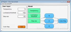
You can download this model directly or via the example models page of the Analytica Wiki. All of this is enabled by a new node attribute available in the Cell Format Expression. You can see this new attribute in the Object window.
The code for the Cell Format Expression is as follows:
CellFormats(
   { Fill color calculation based on red, green, blue input value }
   CellFill(color: (R*2^16 + G*2^8 + B), alpha: alpha1),

   { Font color is black or white to contrast against light or dark fill color }
   IF ( R*0.299 + G*0.587 + B*0.114 ) < Luminance_threshold
   THEN CellFont( color: 'White' )
   ELSE CellFont( color: 'Black' ),

  { Increase cell font size from the default }
  CellFont( size:14 )
  )
First, a note about how colors are characterized and “calculated”. RGB color triplets are usually expressed in one of two ways: with each of the red, green, and blue values between 0 and 255 (R,G,B); or, in hexadecimal notation resulting from the calculation R*2^16 + G*2^8 + B. Hex notation is common in web applications, whereas the base ten RGB triplet is something you see in Photoshop or Microsoft Office products.
In my model, I set up one variable for each of red, green, and blue, and defined each of these as a sequence between 0 and 255 increasing by a Step size variable. This has a User input node so I can adjust how many rows/columns exist in my color map. To make sure I always had the edge cases, I made sure that sequence ended in 255 regardless of step size by concatenating that value to the list if it was not a result of the Sequence function. The hex formula defines the node and the cell fill. There is an additional alpha channel, which controls the Transparency of the color, for which I’ve also added a user input node.
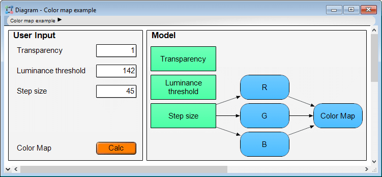
The text displayed in the cell is simply the result of this calculation, but I’ve set the output to display in hexadecimal number format using the Cell format dialog, new to Analytica 5.0. From the results image above, we see that 135 in base 10 must be 87 in base 16. I wanted to be sure this text could be read regardless of how I set up or view my color map, so, I used another characteristic that can be calculated based on the contributions from each of red, green, and blue: the luminance. The greater the luminance, the less contrast there will be between white text and the cell fill color, a case where we’d prefer a dark (low luminance) font color. Based on the monitor I used to build this model, an acceptable Luminance threshold was 142. You’ll see that I also set the font size to 14 to enhance readability.
I encourage you to play around in the model, and let me know what you think! What are some applications you see for this color map? What cell formatting and computed cell formatting applications are you interested in using in your own models?