Visual modeling
Build models the way you think
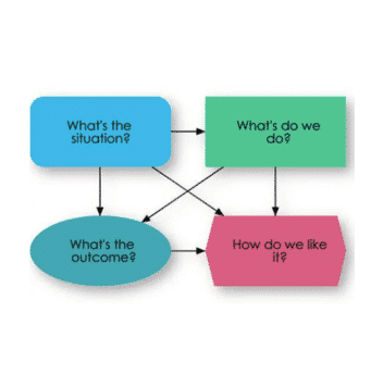
The big challenge in designing a model is to formulate the problem in a way that is clear and tractable. You want to conceptualize the key variables, decisions, uncertainty, data sources, and how they affect the outcomes and objectives. Spreadsheets force you to think at the level of cells. Scripting languages, like R or Python, make you focus on lines of code, when you should be thinking at a higher conceptual level. That’s why Analytica uses influence diagrams. They encourage you to formulate models and explain models visually at this higher level.
“I have been very surprised at the improvement in ease of explaining models to clients using Analytica with its influence diagrams.”

Edgar Brooker,
Gravelroad Consulting, Wellington, New Zealand.
Clarity: influence diagrams
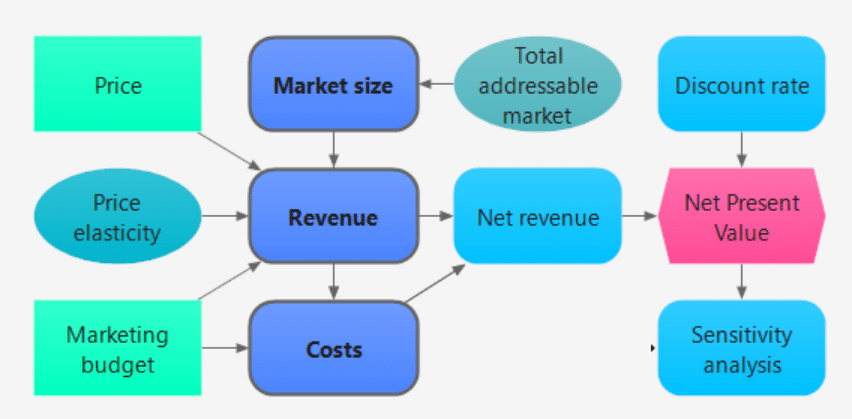
Decision analysts developed influence diagrams as an intuitive way to structure and visualize decision problems. With Analytica, you create variables simply by dragging nodes onto the diagram. You draw arrows from one variable to another, depicting the influences between them. The diagram then becomes the interface you use to navigate the model and communicate with your collaborators, managers and clients.
“What’s so cool about Analytica is that the logic of your model is so clear.”

Michael Wardell,
Roseville Power, Roseville, California
Focus: distinguish the purpose of each variable
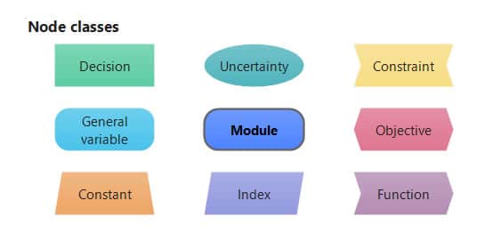
Many analytics tools claim to help you make decisions, but they don’t distinguish decisions from objectives, uncertainties, and other variables. In Analytica’s influence diagrams, you define each variable as a decision, objective, uncertainty, constraint and other types identified by shape and color. The goal is usually to find the decisions that maximize (or minimize) the objectives subject to uncertainties and constraints. By clarifying these roles, you, your colleagues, your clients—and even the Analytica software—know how to treat each variable in the analysis.
“We found Analytica’s influence diagrams were the most natural tool to express our ideas about model structure.”

Eric Pan, MD,
Center for Information Technology Leadership, Boston, Massachusetts
Collaboration: engage with your clients and team
Modeling is most effective when you involve decision makers and other stakeholders to help define the decisions, objectives, and underlying assumptions. Influence diagrams were designed as a graphic facilitation tool to help groups develop a shared understanding of complex decision problems. Even people with limited quantitative skills can quickly grasp the meaning of the node types and influences. With this kind of collaboration, participants understand the assumptions and thereby gain confidence in the final recommendations. The result is a commitment to effective courses of action, and more satisfied clients and analysts.

“After experiencing a live demonstration of Analytica, the CEO of a multibillion-dollar polymer products company exclaimed, ‘I never truly understood the relationships between a profit and loss, balance sheet, and cash flow statements until now.’”

Richard Sonnenblick,
Enrich Consulting, Campbell, California.
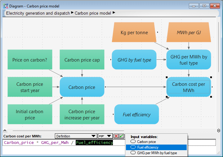
Formulation: influences show dependencies
Influence arrows depict how variables affect each other. An influence may be a simple accounting relationship like
Earnings = Revenues – Costs
Or it may be causal—how the miles driven affects the fuel consumed. An influence may be deterministic or probabilistic—a tree falling onto a power line has a chance of igniting a wildfire. A probabilistic influence may be based on a statistical model fitted to data—such as how insulating a building affects energy consumption. When you don’t have data, you may use expert judgment to estimate the relationship—such as, how a new product will cannibalize sales of an existing product.
Once you’ve drawn influence arrows, you can define each variable by an expression. As you enter the definition, you select from the influencing variables to paste into the expression. If you type in another variable, Analytica automatically updates the arrows to reflect the dependencies. In this way, it offers a clear visual check that the influences are what you intend.
“Analytica is so much easier to use than spreadsheets. The brilliant thing is its influence diagrams. First you build a model graphically, and then fill in the details.”

Fisheries and Oceans Canada, Winnipeg, Canada
Scalability: module hierarchy
You can organize a complex model as a hierarchy of modules. Each module contains its own influence diagram, possibly with nodes showing submodules. Each diagram tells a visual story about its variables, how decisions or chance variables influence objectives. Even for large models with many thousands of variables, this hierarchy provides a clear way to navigate, manage, and communicate the model structure.
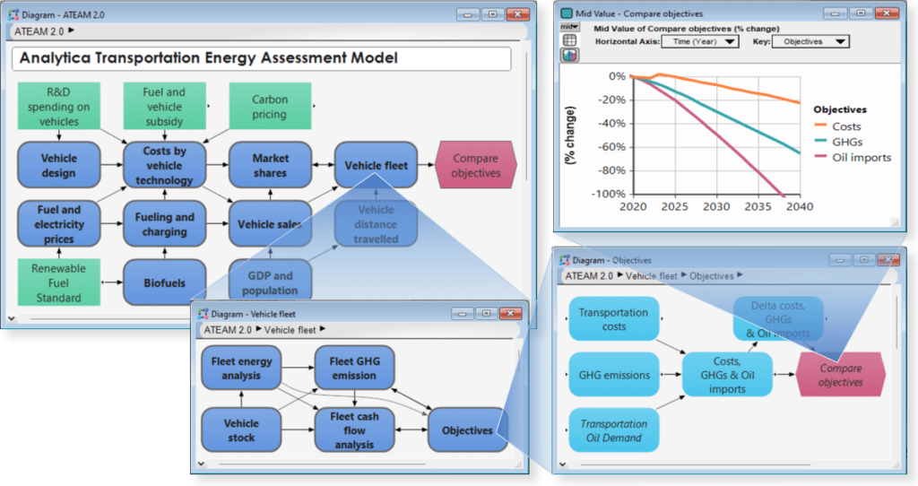
“We liked the fact that Analytica allows models to be graphically depicted as nested modules so that complex networks can be represented at different levels of detail.”

Professor Mark Borsuk,
Duke University, North Carolina


