What is an influence diagram?
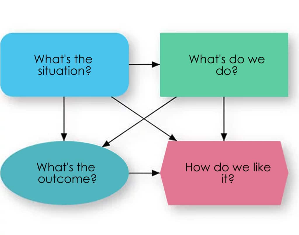
An influence diagram is an intuitive visual display of a decision problem. It depicts the key elements, including decisions, uncertainties, and objectives as nodes of various shapes and colors. It shows influences among them as arrows.
This simple influence diagram depicts a variable describing the situation:
- a standard variable – What’s the situation?
- a decision – What do we do?
- a chance variable – What’s the outcome?
- a final valuation – How do we like it?
These four node types are the building blocks of decision problems. The influence diagram gives a high-level conceptual view on which you may build a detailed, quantitative model.
What do the nodes mean?

A decision is a variable that the involved decision makers identify. This could be whether to invest in a new project, how much to invest, how much to bid, where to locate a new site, or, in this example, what budget to allocate for marketing.

A chance variable is an uncertain quantity, whose value you don’t know, because you don’t have complete information – maybe it’s in the future – and which, (unlike a decision), you cannot control directly.

An objective is a measure of your satisfaction with possible outcomes. It might be net present value, lives saved, or earnings before interest, taxes, depreciation, and amortization (EBITDA), or more generally, utility. Usually, the decision maker is trying to find options to maximize (or minimize) the objective.
Often, an objective combines multiple sub-objectives or attributes, which may be in conflict – such as energy costs, and environmental and health risks. Usually, when the objective is uncertain, decision analysts suggest maximizing the expected value, or more generally, expected utility, based on risk preference.

A general variable is a deterministic function of the quantities it depends on. A deterministic function means you have all of the information needed to calculate with certain accuracy.

An arrow denotes an influence or relationship between nodes. An arrow from A to B means that knowing A would directly affect our belief or expectation about the value of B. An influence expresses knowledge about relevance. It may, but need not, imply a causal relation, or a flow of material, information, or money.
How do you create influence diagrams in Analytica?
This video tutorial shows you how to use Analytica’s influence diagrams to make models more transparent and intuitive. (4 min)
Within Analytica, you can draw an influence diagram simply by selecting new nodes, placing them into your model and drawing arrows among the different variables. When you specify a formula for a variable to define its quantitative definition, you can select directly from its inputs – the variables from which there are incoming arrows.
Or, if you use other variables in the definition, the arrows will automatically redraw to keep the diagram consistent with the underlying relationships to give you a clear graphical representation of how you are evaluating your decision.
How does Analytica extend influence diagrams?
Analytica extends the standard influence diagram notation with additional types of node, to provide the power and flexibility to handle real-world problems of greater complexity than can be handled with conventional tools.
1. Hierarchy of modules
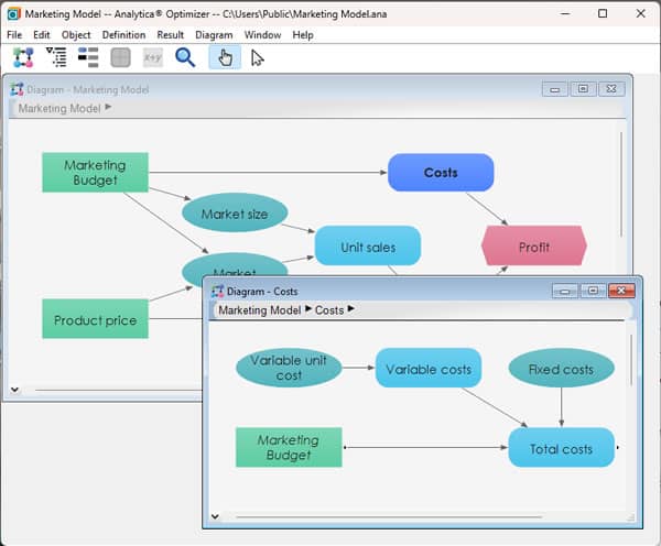
With module nodes, you can organize a complex model as a hierarchy of modules. Double-click on a module node, such as Costs, to display its details as another diagram.
Using Analytica’s modules, you can organize a model containing hundreds, or even thousands, of variables into a hierarchy of diagrams, each of which is small enough to be easily comprehensible and manageable.
2. Variables as multidimensional arrays

Standard influence diagrams assume that variables are scalar quantities, or only have a single absolute value. In Analytica, a variable may be a vector, or a multidimensional array. For example, Analytica can include information pertaining to the market size and sales for each region, each product, and each time period. Analytica employs index variables to identify the dimensions.
3. User-defined functions
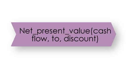
You can use existing libraries of functions to extend the richness of Analytica’s modeling language for particular problem domains. Or you can create your own functions.
4. Diagrams with feedback loops
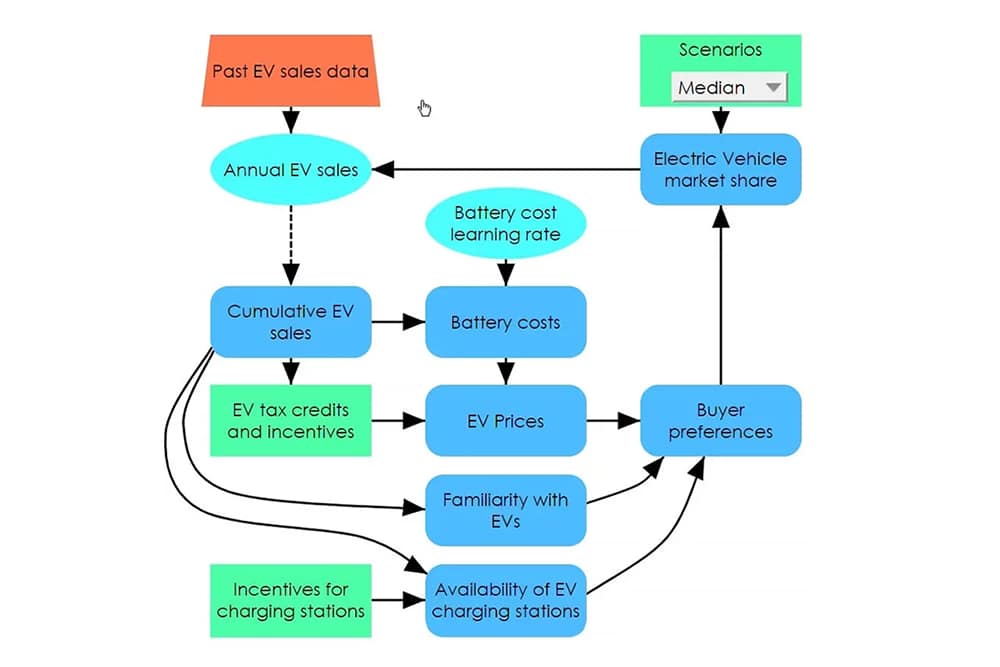
Traditional influence diagrams don’t permit feedback loops – for instance, Marketing budget -> Market share -> Revenues -> Marketing budget. Analytica, however, does let you create loops like this in a dynamic model, provided there is a time lag, denoted as a dashed arrow, somewhere in the loop.
Who invented influence diagrams?
Several people from the decision-analysis community were involved in the creation of influence diagrams.
Professor Ronald Howard from Stanford University and his colleague, Dr. James Matheson, refined and popularized influence diagrams as a convenient notation for communicating about decision problems, that is complementary to decision trees.
Where can you learn more?
- Analytica user guide: Chapter 6: Creating lucid influence diagrams.
- Book: Uncertainty: A Guide to Dealing with Uncertainty in Quantitative Risk and Policy Analysis, Cambridge University Press.
- Book: Making Hard Decisions: An Introduction to Decision Analysis, Duxbury Press.
Author


