It has only been about a month since the new strain of a coronavirus appeared in the city of Wuhan, Hubei province, China. Yet it seems that the rapid growth of confirmed cases and deaths has captured almost everyone’s attention around the world. Like many other people, I wondered what the mortality rate of the disease is. If a person is diagnosed with it, what is the probability that person will die from it? For the past two days, since we learned that a case has been confirmed here in Santa Clara county, this has been a repeated topic of discussion here.
I did a Google search and found many really good pages that are tracking the statistics on this outbreak, with the majority of them reporting a mortality rate of 2%. But I quickly realized that they were getting this number by dividing the number of reported cases by the number of reported deaths as of today. That is clearly wrong, because those who have died were diagnosed a few days earlier when the number of confirmed cases was much smaller (the confirmed cases are growing extremely fast). So the mortality rate has to be higher than 2%.
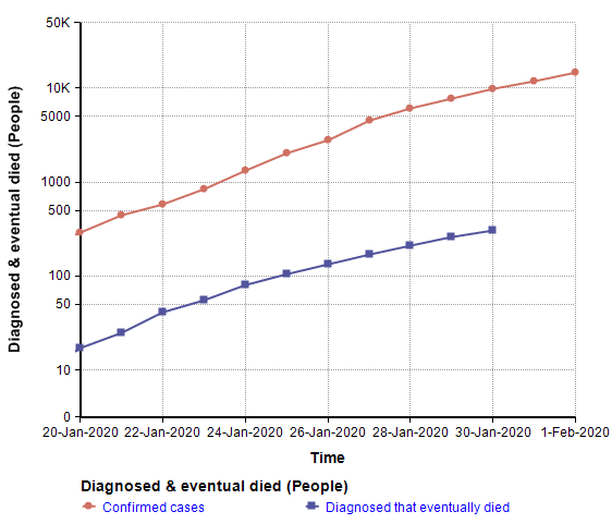
The following chart shows the number of reported cases and the number of reported deaths on a log-Y scale.
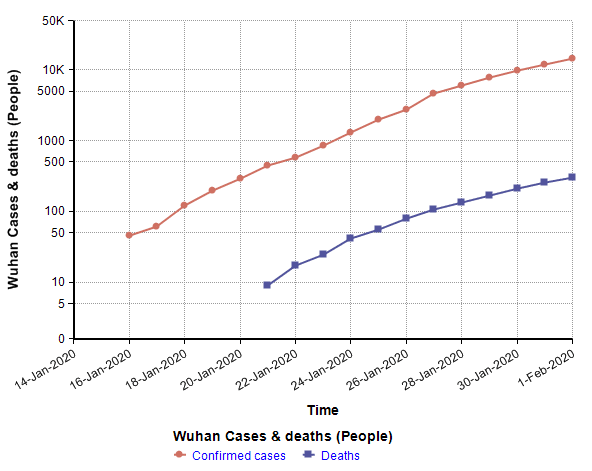
These are close to linear since we are in the early exponential growth phase of the outbreak, and are approximated pretty well by
ReportedCases(t) = exp( 0.2969 t1 )
Deaths(t) = exp( 0.3082 t2 )
where t1 is the number of days since 31-Dec-2019 00:00 and t2 is the number of days since 12-Jan-2020 01:00. (the time origins of the fitted curves are shifted by 12.5 days)
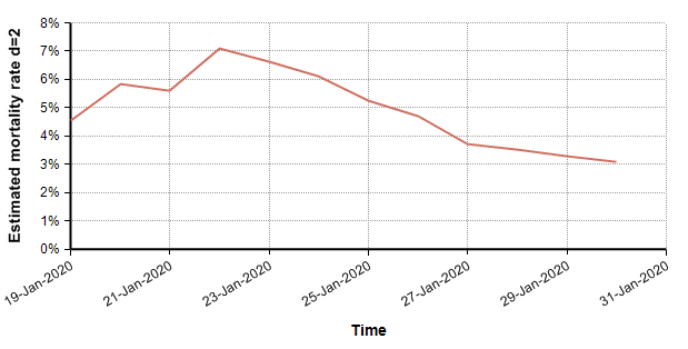
Let d be the average number of days from reported confirmed diagnosis to reported death of the patients who have died. One way to improve the mortality estimate is to shift the death curve left by d days, and then take the ratio, so that the number of deaths is aligned with the date when the patient was diagnosed. Using d=2 for illustration (which is nothing more than a guess) the curves now compare as follows.
The ratio of these curves at each time point serves as an estimate of mortality rate, each time point being a separate estimate.
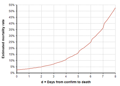
The average here is 5%. This estimate of mortality rate is extremely sensitive to the estimate for d. In the following graph, you can see how the estimated mortality rate increases as the latency between diagnosis and death increases.
So, a big open question is: What is the latency between diagnosis and death? This is not the same as the incubation period for the disease.
I came up with one method for estimating the latency, d, from the data, but result is not believable. The idea was simple — the time origins for the two regression fits (given above) are shifted by 12.5 days. That seems like it suggests a latency of d=12.53. But that yields a mortality rate of 240%. If the vast majority of people who died from it never appeared in the confirmed cases, but were listed in the number of deaths, the ratio of deaths to confirmed cases could theoretically surpass 100%, but this seems implausible to me. I think it is safer to conclude that this method for estimating latency is unreliable due to many other confounding factors.
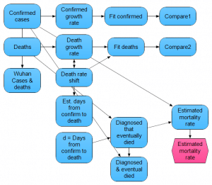
This outbreak is scary. Nevertheless, if you are a modeling aficionado, given our current state of uncertainty, it gives us a lot of opportunities to build interesting estimation models. From the following hyperlink, you can download the very simple Analytica model that I created while writing this post.

