(Posted on 15-Apr-2020)
On 26-March-2020, researchers at the Institute for Health Metrics and Evaluation (IHME) at the University of Washington published their first COVID-19 forecast [IMHE20a] and launched a website at Healthdata.org with projections that get updated regularly. This has become the most influential COVID-19 forecasting model to date. I’ll bet you’ve seen the model’s predictions, and even if you haven’t visited healthdata.org, you’ve no doubt heard its predictions stated in numerous newscasts or articles as if the predictions are fact. In addition to the media, the White House team has also been relying quite heavily on this model, and has cited it daily during the presidential press briefings. All this faith is placed in this single model, but do you have any idea how it works? How does the model compute the forecasts? What assumptions does it make? Does the model have notable strengths or weaknesses? Should you believe its projections? In this article, I take a stab at answering these questions.
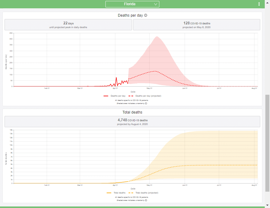
To explain how this IHME model works (as I understand it), I introduce key concepts one at a time, incrementally building up to a description of the full model (at least of the core forecasting part). During this, I will also be highlighting and critiquing key assumptions. While the IHME group has done a stellar job, I think it is always important to understand limitations of any model. Every model is a simplification of reality, so all models have limitations, and are usually good for certain things but not everything. I find it disturbing that so many people are quoting this model’s predictions as if it is fact, without have an understanding of what its limitations are.
I am not associated with the group at IHME who created and continues to develop the model. I’ve learned about it from reading, rereading and rereading the articles and code materials that the group has released, and by attempting to re-implement the model to reproduce their results. In an email, a member of IHME told me the model has been continuously and rapidly changing, so that the information about the model they have made public ally available so far is already out of date, so until their next article is posted, I base this on materials that have been revealed as of this writing (15-Apr-2020) [IHME20a, IHME20b, APM20]. I am also intentionally describing much of what they have done in a different but mathematically equivalent terminology, and from a different perspective, which I hope is more understandable to a larger audience.
Trend fitting
One method used by statistical models to forecast the future is to extrapolate trends in historical data. For example, in an article I wrote a few weeks ago [C20], I showed that the number of total deaths in the US from COVID-19 at that time was following an exponential growth curve. When plotted with a log-Y axis, the daily deaths form a straight line.
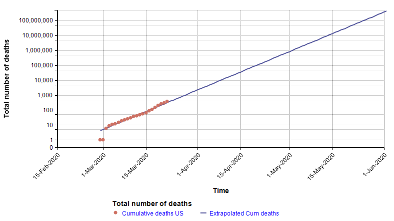
Because the points form a straight line when graphed with a log-Y axis, it is possible to extrapolate into the future by extending that trend line, as shown with the blue line on the above graph. That extrapolation done on 22-March turned out to be very accurate up through 2-Apr-2020, but then from 3-Apr-2020 the growth started exhibiting a downward curvature.
This next graph shows the daily growth rate of deaths from COVID-19 in the US (i.e., the growth from the previous day to the current day) as red dots.
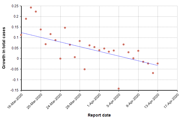
The trend line suggests a downward trend in growth rate. During idealized exponential growth, this trend line would be horizontal, with no slope. The downward slope suggests that growth is slowing, and in fact the date at which it crosses zero, 8-Apr-2020, could be interpreted as the “peak” in deaths. Once the growth is consistently negative, we are in a stage of exponential decay.
When you fit a straight line to the change in daily growth, what you are implicitly doing is fitting a quadratic curve to the logarithm of daily deaths, y.
\log(y) = \alpha ( x – \beta )^2 + c
This can be rewritten in the form
y = d \cdot \exp( \alpha (x – \beta)^2 )
The second equation has the form of the Normal distribution density function. This leads to a second approach, which is to fit a scaled cumulative Normal distribution function to the cumulative number of deaths. It is scaled by multiplying the cumulative Normal function by a constant, d, so that its limiting value is something other than 1.0. The following graph fits a Normal curve to the total number of deaths from COVID-19 in the state of Colorado, where the red line is the historical data (from [NYT20]) and the blue line is the fitted normal curve.
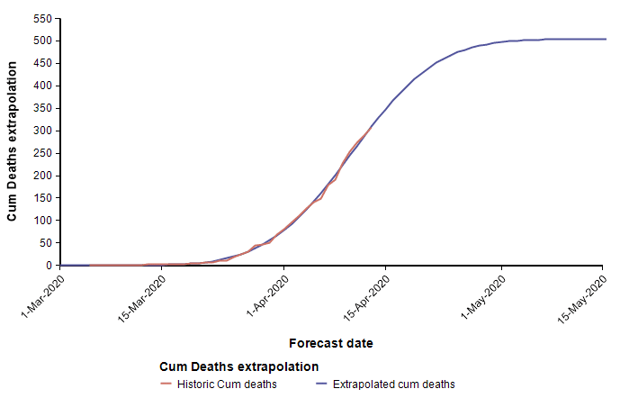
With this fit to the cumulative number of deaths, we can then superimpose the daily difference of the extrapolated curve on the daily number of deaths.
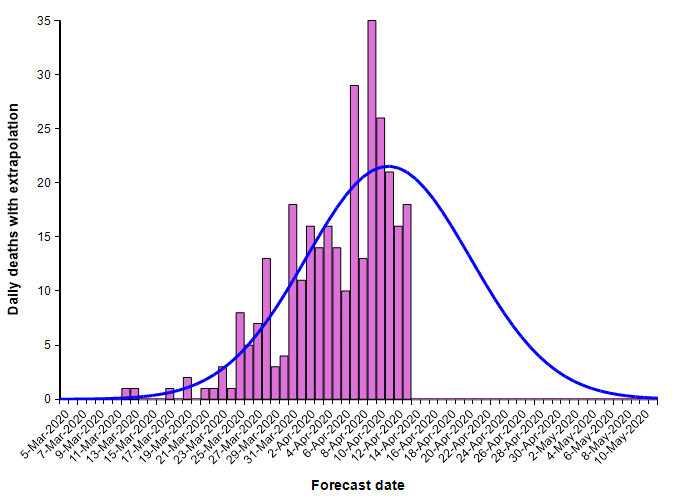
The peak occurs here at 11-Apr-2020. Note that I fit this normal distribution to the data by minimizing least-squares error — it is not a prediction from IHME. Finding the parameters requires a non-linear optimization.
What I’ve just described is a key part of the IHME COVID-19 model. The IMHE model “fits” a scaled cumulative Normal distribution curve to the historic cumulative number of deaths from COVID-19 at the level of each individual state. The mean forecast for the entire U.S. is obtained by summing the mean forecasts for the individual states. It is in this manner that the model incorporates current trends into its forecast.
The goodness of fit is one important criterion that goes into judging the quality of the fit of the cumulative Normal curve. Although I’ve only talked about goodness of fit so far, the IHME model also incorporates a few other criteria as well, which I cover below.
The heart of the IHME model is the forecast for total deaths at the state-level administrative regions. The model also predicts demand for hospital beds, ICU units and ventilators. All of these are derived from the cumulative deaths forecast once that is obtained. For example, once you know that 15 people are expected to die on 20-Apr, you could reason that 95% of these required ICU for 5 days, and hence add 14 ICU units to the demand for the preceding 5 days. Since the model of cumulative deaths underlies everything else, I’m focusing predominantly on this core forecasting aspect of the model in this article.
Up to this point, you’ve learned that IHME model represents cumulative deaths from COVID-19 at the state level using a scaled cumulative Normal distribution curve. Each state’s forecast can thus be described by three parameters that determine: The maximum growth rate (\alpha), the date of the peak (\beta) and the limiting value (d).
Symmetry assumption
The choice to represent the progression of deaths over time as a scaled Normal distribution is the most important simplifying assumption made by the model. The most obvious property of the Normal distribution function it its symmetry.
The left third of a Normal density function closely resembles exponential growth, and the right third closely resembles exponential decay. Hence, the Normal distribution approximately encodes a Triangle Suppression model. This is a pretty important point, so if you haven’t already read the Triangle suppression article, you should. That article provides a foundation to enable you to judge how realistic the symmetrical representation used by IHME is, and what the implications are for the quality of its forecasts regarding how long the recovery will take after we pass the peak.
During the exponential growth phase (up to 2-Apr-2020), the number of deaths in the United States grew by an average of 22% per day [C20]. When Wuhan City was locked down and the peak was passed, the number of deaths in China decayed exponentially at a rate of 10% per day [C20]. There is reason to believe that the Wuhan recovery rate is an upper bound on the recovery rate for states in the US, since the social isolation measures taken there were stricter than those adopted in the US. Hence, we should believe that recovery will take at least twice as long as growth, and quite possibly 3 or 4 times longer.
The symmetry assumption made by the IHME model means that it assumes recovery after the peak will decay at the same exponential rate as the exponential growth rate before the peak! Hence, the symmetry assumption builds in an overly optimistic bias the forecasts for how long it will take to get through the recovery. Because the recovery phase will almost certainly last longer that predicted, the total number of deaths during that time will also be underestimated.
In the best case, where the recovery in US states occurs as fast as in China, the actual time required for recovery will be twice that predicted by the IHME model, and the total number of deaths will be 50% higher. In places where the recovery rate is half that of China (5% per day), the recovery time will be four times longer than predicted by the IHME model and the total deaths will be 2 and 1/2 times higher.
On the other hand, if COVID-19 has the same seasonality as the flu, we might see a rapid decline starting now as a result of warming temperatures. This time-of-year coincidence could result in a decline that is faster than the decay rate in China. This would not apply to countries in the southern hemisphere, or to resurgences that might occur here in the fall.
I believe it would be relatively easy to adjust the IHME model so that it uses a non-symmetrical curve. For example, the left side of the peak could be the same curve currently used, while the right-side of the peak would double the alpha values. But for the moment, it is important to appreciate the limitations imposed by the symmetry assumption, and the likelihood that this assumption will turn out to be wrong, as revealed by the Triangle suppression model [C20].
Sensitivity to data fluctuations
We’ve seen that the IHME model captures trends by incorporating a goodness of fit criteria (among others) when finding the parameters of its model. This is a great way, in theory, to extrapolate where the peak will be from the curvature observed in the data time series. However, in practice, it is more difficult than you might at first think.
Above I already showed current data from the state of Colorado that I fit using a cumulative normal distribution, which placed us at the peak, or just barely passed it as of 13-Apr. To my intuition and knowledge, this result seems plausible. However, the curves for Arizona and California appear implausible.
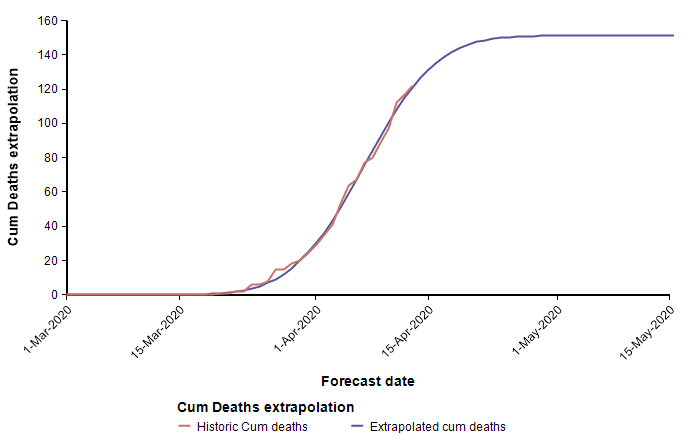
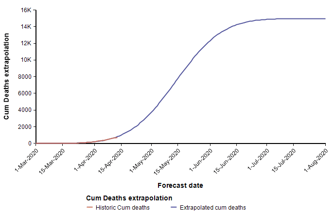
These two curves minimize the least squared error of the Normal function to the data, but appear to have done a poor job at estimating the peaks, with Arizona’s peak predicted to be too early, and California’s predicted to be too late. As a result of these errors, the limiting number of deaths for Arizona will almost certainly be underestimated by this curve, whereas the limiting number of deaths in California is more than it should be (however, this does offset the symmetry bias discussed in the previous section). These errors are simply artifacts of the sensitivity of the parameter determination to random fluctuation in the data. Consider, for example, data points that are following a classic exponential growth curve. The entire 1/3 of the Normal function matches exponential growth very closely, so it is extremely difficult to tell how far up that growth curve you actually are. Minuscule changes to data points can cause a substantial shift in the predicted peak. Although the peak date and the limiting number of deaths are not reliably determined, the estimated growth rate parameter probably is quite accurately estimated.
What these examples illustrate is that it doesn’t work well to rely simply on goodness of fit to data to estimate when the peak will occur. The IMHE team, however, worked out an additional and different criteria to help pinpoint the peak date.
The cost of delaying lock down
The fourth death from COVID-19 in Wuhan, China occurred on 19-Jan-2020. Given the population of Wuhan, it means that on that day, the death count passed the 0.31 deaths per 1M population mark. This is an arbitrary threshold, but is the threshold that IHME uses to determine the “start” day for a region. Chinese authorities locked down Wuhan city on January 23rd, which would be day 4. The lock down immediately reversed the rate at which new people were getting infected, but it took a while for people who were already infected to progress through the illness and die. The number of daily deaths from COVID-19 reached its peak in China around day 29.
From this experience, it would be reasonable to estimate that elsewhere in the world, a region that implements a lock down around day 4 ought to see its peak in number of deaths around day 29.
Using the 0.31 deaths per 1M population threshold, some start dates would be:
- Arizona: 24-Mar-2020 (shelter-in-place on day 7)
- California: 17-Mar-2020 (shelter-in-place on day 2)
- Colorado: 13-Mar-2020 (shelter-in-place on day 13)
IHME posits that there is a penalty, \bar{\gamma} , for each day that a state delays before implementing a lock-down order. For illustration, let’s estimate that penalty to be \bar{\gamma}=2 days. So, to estimate the day number of the peak for a given state, multiply the shelter-in-place day by 2 and add 21. Using this rule, the peak would be predicted to be
- Arizona: Day 21 + 2*7 = day 35 = 28-Apr (compare to 11-Apr)
- California: Day 21 + 2*2 = day 25 = 11-Apr (compare to 13-Apr)
- Colorado: Day 21 + 2*13 = day 47 = 29-Apr (compare to 20-Apr)
In parentheses I included a comparison to the predicted peak date from the Normal curve fit from the earlier section.
In each state, social isolation measures have been introduced in stages. For example, first large event gatherings are banned, then schools are closed, then orders for the elderly to stay-at-home are issued, and finally comprehensive shelter-in-place orders go into effect. With this staging, you can’t really pinpoint a single day when isolation measures started. To account for this, they count the number of days without lock down by adding 1 for a day before any isolation measures are active, 0.67 if one isolation measure is active, 0.33 if only two isolation measures are active, and do not count days where 3 or more isolation measures are active [NZ20, IHME20a]. They denote this number of days without lock down as S_j, where j indexes the state. They use \beta_j to denote the day number of the peak for state j, and \beta without a subscript to denote the duration from start to peak when lock down is active from day 0 (Above I suggested \beta=21 days). With these, the day number for the peak for state j is estimated to be around
\beta_j = \beta + \bar{\gamma} S_j
Of these, S_j is determined from the data (news reports about when social isolation measures were adopted, and total deaths history to determine the “starting day” for that state). \beta and \beta_j are solved for during an optimization process (a data fitting process). And bar{gamma} is specified by human — not determined from data. (But, I’ll discuss later how they allow the model to make state-specific fine-grain adjustments to \hat{\gamma}). The same value for beta is used for all regions (states).
One assumption that is implicit in this method is that every state will, if fact, implement lock down measures. For states that have not implemented lock down measures yet, they assume (according to their paper) that the state would implement stay-at-home level lock down 7 days in the future.
Combining multiple criteria
I’ve discussed two rather different methods used by IHME for forecasting when the peak will occur in a given state. One method fits a scaled cumulative Normal shape to historical data. The other method assumes a predictability in the number of days from start to peak, with an extra linear penalty for delay in adopting lock down measures. The IHME model uses a combination of both. When you have two different criteria for the same parameter, how you can you combine them? I describe one method that boils down to taking a weighted average — not of the value, but of the scores for each possible value.
Suppose you were to propose a growth rate, peak date and limiting number of deaths for a particular state, say California. These are the parameters we need in order to fully specify the Normal curve. Then, for each of the two methods, let’s create a “score” for that choice.
For the curve fit, we can use average squared error. For each historic data point, measure the difference between the value on the curve and the data point for that day, and square it (this will always be a positive number). Then we can average these differences to get a goodness of fit score, where a smaller number means a better fit.
To get a score for the second method, we can also use a squared error, (\beta_j – b)^2, where \beta_j is the peak date predicted by the second method, and b is the proposed peak date. Again, this is always positive, with lower values indicating better agreement.
You can obtain an overall score by just taking a weighted average of the two scores, where the relative weight would be a setting provided by a human. Since the units of measurement of the two scores is not the same — the first metric has units of squared deaths, the second has units of squared days — the ratio of the weights given by a human does not indicate the relative importance given to both. The weights would balance this difference in units as well as encode a relative importance of each criteria.
With this combined “score”, an algorithm searches the space of parameters to find a combination of parameters that minimizes the combined score — the net least squared error. The resulting parameters describe a Normal curve that balances the two criteria.
My description here combines the two methods using curve-fitting language (least squared-error), which I hope feels familiar to many readers. However, the IHME group describes the algorithm differently, in a language of maximum likelihood. The two descriptions are mathematically equivalent. The maximum likelihood jargon requires a familiarity with statistics, but is a more elegant and flexible language if you have the statistical background.
Maximum likelihood
Statistics has another “language” for describing the curve fit and cost of lock down delay methods, which is called maximum likelihood. The formulation is mathematically equivalent to the minimization of squared error description from the previous section, which I’ll discuss in this section. This part is not essential for understanding the assumptions and limitations that are built into IHME; however, since the IHME group describes their algorithm in the statistical language of maximum likelihood, I’ll explain this formulation here.
Let \alpha_j, \beta_j, and d_j be the parameters describing a Normal curve for region (i.e., state) j. Let (t, y_{j,t}) be a data point — here t is the number of days past the start, and y_{j,t} in the cumulative number of deaths up to that day in the state. Note: We can alternatively use the cumulative number of deaths divided by the state population — that distinction doesn’t make a difference so what I’ve discussed so far. We can now write
y_{j,t} = d_j \Phi( \alpha_j ( t – \beta_j ) ) + \epsilon_{j,t}
p(\epsilon_{j,t}) = \phi( \epsilon_{j,t} \sigma )
where \Phi(x) denotes the standard cumulative Normal curve, \phi(x) denotes the standard normal density function, \epsilon_{j,t} is the amount of noise in the t^{th} data point, also called the residual, \sigma is a standard deviation parameter that is provided be a human (a prior), and p(\epsilon_{j,t}) is the likelihood of the data point y_{j,t}. A maximum likelihood fit of a Normal curve to the data points solves for
\arg \max_{\alpha_j,\beta_j,d_j} \prod_t p(\epsilon_{j,t})
p(\epsilon_{j,t}) = \phi\left( {1\over\sigma} \left(y_{j,t} – d \Phi( \alpha_j (t – \beta_j))\right)\right)
where the product is taken over all data points. This is called the maximum likelihood solution. Carl Friedrich Gauss proved that with normally-distributed error, as we have here, the least squared error solution and the maximum likelihood solutions are the same. Hence, maximum-likelihood with Gaussian error and least-squared error curve fitting are mathematically equivalent.
Next, let’s recast the second method for estimating \beta_j, the day on which the peak occurs in state j, in terms of maximum likelihood. To do this, we’ll need another residual error variable. It is pretty standard to use an epsilon character for residual error, but since I’ve just used \epsilon_{j,t} above, I’ll need some way to distinguish this new residual variable from the one already used. To do that, I’ll write \epsilon_j^beta. The beta subscript is just simply part of the name, and not an exponentiation. I’ll also need another symbol for a new standard deviation prior, so to distinguish this new one from the previous \sigma, I’ll write \sigma_\beta. The peak prediction becomes
\beta_j = \beta + \hat{\gamma} S_j + \epsilon_j^\beta
p( \epsilon_j^\beta ) = \phi( \epsilon_j^\beta \sigma_\beta )
where p( \epsilon_j^\beta ) is a normally-distributed likelihood, and \beta, \hat{\gamma} and S_j are the same as before. To combine the two methods, we multiply the likelihoods and solve for the maximum likelihood
\arg \max_{\alpha_j,\beta_j,d_j} \prod_t p(\epsilon_{j,t}) p( \epsilon_j^\beta )
With the formulation as I have described it so far, a human provides the following parameters as “priors”: \beta, \hat{\gamma}, \sigma, \sigma_\beta, and the optimization solves for \alpha_j, \beta_j, and d_j. At this point, this can be done separately for each state.
When I combined the two methods in the least squared error formulation, it was necessary to provide relative weights for each of the two methods. In the maximum likelihood formulation, we simply multiply the likelihoods from each part together, with no need to introduce additional weights. However, the standard deviation parameters, \sigma and \sigma_\beta, play the same role in the maximum likelihood formulation as the relative weights did in the least squared formulation. A larger value of \sigma creates a weaker prior for the goodness-of-fit criteria, so that it gets weighted less heavily.
Coherence between regions
Using the core ideas in the IHME model that I’ve described up to this point, you can treat each region (i.e., state) independently. But maybe there is something about Colorado that can be learned from the data from Arizona (or other states). For example, there will probably be a lot of similarity between the maximum growth rates, \alpha_j. Also, there will probably be a lot of similarity between the limiting death per capita, where a death per capita of 0.001 means one death per thousand people. (The IHME papers use the term “death rate” for death per capita, which I dislike since it sounds like a change over time). If you were solve each state separately, and then you noticed that all states had similar growth rates, \alpha_j, except for Colorado, you’d probably want to adjust the estimate for Colorado to be a bit more like the others.
To incorporate these ideas, we could add a penalty when a region has a growth rate that is a lot different from the average growth rate, and a penalty when a region has a limiting deaths per capita that is a lot different from the average across all regions.
The IHME group incorporated this idea. This creates a dependence between regions, which means that the optimization can no longer be done separately for each state.
As before, it is possible to incorporate this penalty in a least squared formulation by adding in the penalty with a human-selecting weighting. Or, equivalently, you can add this penalty into a maximum likelihood formulation by introducing addition residual terms and priors. The following uses the maximum likelihood formulation. A first cut (not the eventual one) might be the following formulation for average growth rate in region j
\alpha_j = ave(\alpha_j) + \epsilon_j^\alpha
where \ave(\alpha_j) is the average of all the \alpha_j, and \epsilon_j^\alpha is a new normally-distributed residual variable. The likelihood is maximal when all the \alpha_j are equal, and hence, all the \epsilon_j^\alpha are zero. This formulation requires an extra constraint to ensure that \alpha_j > 0, and in the event that the optimizer explores a prospective solution where the constraint is violated, many of the other equations may end up with undefined values, which can mess up an optimization engine. To ensure that can’t happen, the IHME model put the right-hand side in an exponential, which is always positive.
\alpha_j = \exp( \alpha + \epsilon_j^\alpha )
Using the usual likelihood function
p( \epsilon_j^\alpha ) = \phi( \epsilon_j^\alpha \sigma_\alpha )
This adds an extra parameter, \alpha, with no subscript, which is the average taken over all regions of the natural logarithm the regional growth rate. You can add \alpha to the variables that the solver needs to solve for, since the priors force \alpha to be this average.
The exact same idea is applied to the limiting deaths per capita. Using the limiting number of deaths divided by the population as y_t, the scaling multiples, d_j, should be similar between states, and also always positive. Hence, you can add in the prior
d_j = \exp( d + \epsilon_j^d )
p( \epsilon_j^d ) = \phi( \epsilon_j^d \sigma_d )
The IHME model also incorporates this idea into the penalty for postponing lock down. So far, I’ve described this penalty as being the same value, \hat{\gamma}, for all states, and that this penalty is specified by a human. The IHME model allows this penalty to vary by state, but they give it an incentive to use a similar penalty for each state. The penalty for postponing lock down one extra day in state j is denoted \gamma_j, and is given as
\gamma_j = \hat{\gamma} + \epsilon_j^\gamma
p( \epsilon_j^\gamma ) = \phi( \epsilon_j^\gamma \sigma_\gamma )
The expected penalty, \hat{\gamma}, is specified by a human, and is considered to be part of the prior. \sigma_\gamma determines how much the penalty in individual states is allowed to deviate from this expectation. So the peak in state j is now
\beta_j = \beta + S_j \gamma_j + \epsilon_j^\beta
With coherence between regions, the optimization now has to solve for these variables: \alpha_j, \beta_j, d_j, and \gamma_j. The averages, \alpha, \beta, and d, can either be computed explicitly as averages of \ln(\alpha_j), \beta_j-\gamma_j*S_j, and \ln(d_j) respectively , or can be included as variables for the optimizer to solve for. The priors (which defined the likelihood functions) are provided by human-supplied parameters: \hat{\gamma}, \sigma, \sigma_\alpha, \sigma_\beta, \sigma_d, \sigma_\gamma.
Uncertainty bands
One of my favorite features with the IHME model is the display of uncertainty bands. I am very happy that they chose to acknowledge the intrinsic uncertainty in a forecast like this, even if most media reports ignore the wide range of uncertainty when quoting forecasts.
The technique they used to estimate the range of uncertainty [IHME20b] is based on a deep concept from statistics called Fisher Information, along with a related result called the Cramér-Rao bound.
The optimization process solves for the best solution (i.e., maximum likelihood) for the parameters, \alpha_j, \beta_j and d_j, for all the states. The trouble is that this alone doesn’t tell you how accurate those are. You can express accuracy as a variance. Once you have that variance, you can randomly sample from the parameters, each time obtaining a new set of normal curves, and from that identify bands. Note: I did not find any documentation for which percentiles are depicted in the HealthData.org dashboard.
The trick is to figure out what the variance is for the parameter estimates. The Cramér-Rao bound says that the variance can never be less than the reciprocal of the Fisher Information for the parameter. An ideal parameter estimation algorithm might approach this bound, so they make the assumption that their variances equal the bound (the best case). To get the variance, they estimate the Fisher information. The Fisher information is a property of the parameter, and not a property of the data used to find the parameter.
In the general case, the calculation of Fisher information requires taking an expectation over all possible data sets (which can be done with Monte Carlo) of a derivative of the log likelihood. But in the special case where the prior is Gaussian (which it is here), you can combine the Jacobian vector at the maximum likelihood solution with the inverse covariance matrix — formed in this case by placing the reciprocal squared of each prior standard deviation along the diagonal. The Fisher info is just J^T \Sigma^{-1} J [APM20].
The uncertain bands should be interpreted as the parameter uncertainty when the model’s core structural assumptions are correct. Ontological uncertainties, such as the possibility that reality will not follow a symmetric scaled normal curve, are not captured by these bands estimates. I think a lot of people are surprised by how wide the uncertainty bands are. I think the wide bands that occur for about a week from the current date are justified; however, I find it surprising that the uncertainty bands narrow, eventually to zero, as you get out more than one week into the future. It is highly unusual for a forecast of an uncertain future to become more certain as you get further out in the future. Many of the forecasts on HealthData.org reach zero uncertainty in the number of daily deaths one month in the future. Would you agree that we are far more certain about how many people will die from COVID on June 1st than we are about how many people will die tomorrow?
Summary
The key ideas/assumptions that go into the IHME forecast are:
- Forecast cumulative COVID-19 deaths first. All other forecasts (ventilators, beds, etc.) are based on cumulative deaths.
- Cumulative deaths in each state follows a cumulative normal curve.
- Each state’s trajectory is defined by 3 parameters: growth \alpha_j, day number that the peak occurs on, \beta_j, and limiting deaths per capita, d_j.
- The symmetry of the Normal curve builds in the assumption that recovery after the peak in each state will occur at the same rate as growth before the peak. This assumption seems to be contradicted by existing data.
- Hence, it is likely to underestimate recovery time after the peak.
- The peak is determined by a combination of
- A standard number of days from a starting point plus a penalty for each day that isolation measures are delayed.
- Goodness of fit of historical data to the Normal curve.
- There is an assumption that all regions (i.e., states) should have similar parameters.
- This enables data from all states to inform the curve for each individual state.
- Parameter values that vary a lot from the average are penalized, so the data has to be more compelling to justify an outlying parameter value.
- The forecast for the entire United States is not fit with its own parameters — it is obtained by summing the forecasts for the individual states.
- The national forecast is not constrained to be symmetrical. This is because the peaks of individual states will be staged in time (especially given that they implemented lock down measures at different times).
- The core ideas find the mean forecast (the single line through the middle of their dashboard graphs).
- Uncertainty in the forecast can be estimated from the Fisher Information and Cramér Rao bound based on the Jacobian of the parameters at the maximum likelihood solution.
- Although this is a really neat approach, the behavior of the uncertainty estimates is questionable. It implies that we are much more certain about the daily deaths one month in the future than we are about the number tomorrow. Normally we have more uncertainty about what will happen in the distant future.
For the sake of length, I have not covered how bed, ICU and bed demand is determined once the death forecast has been pinned down. That aspect involves the incorporation of a lot of information and facts, but is far more straightforward than the core forecast.
The folks at IHME have done an excellent job designing this model. They have told me that since their initial publication just over 2 weeks ago, the model has evolved substantially. However, given that any model is a simplification of reality, I am bothered by the degree to which everyone seems to have accepted the forecasts with little idea about how the forecasts are derived, or what the limitations are likely to be. The materials thus far published by IHME emphasize the forecast results, and lack clarity and completeness when it comes to describing how the model works. I hope this article has helped back fill these gaps.
References
- [APM20] Aleksandr Aravkin, Peng Zheng, Marlena Bannick (2020), “Curve Fitting for the COVID-19 Project: IHME-UW Documentation Site“, GitHub repository.
- [C20] Lonnie Chrisman (23-Mar-2020), “Suppression strategy and updated forecast for US deaths from COVID-19 Coronavirus in 2020“, Analytica blog.
- [IMHE20a] IHME COVID-19 health service ulitization forecasting team (26 March 2020), “Forecasting COVID-19 impact on hospital bed-days, ICU-days, ventilator days and deaths by US state in the next 4 months“, MedRxiv. doi:10.1101/2020.03.27.20043752.
- [IMHE20b] IHME COVID-19 health service ulitization forecasting team (25 March 2020), “CurveFit Tool for Covid-19 Model Estimation“, Preprint submitted to MedRxiv, tracking ID MEDRXIV/2020/043752
- [NYT20] New York Times, “Coronavirus (Covid-19) Data in the United States“, Data from The New York Times, based on reports from state and local health agencies.
- [NZ20] New Zealand government (2020), “COVID-19 Alert System“


