The COVID-19 pandemic has given many people a crash course in the frightening implications of rapid exponential growth in cases and deaths – what some people call “J-curves”. As regions and nations try to suppress the epidemic with travel bans, stay-at-home orders, widespread testing, and other measures, they may shift to a more encouraging kind of curve – now an exponential decay – which is what we have seen in China. My colleague, Lonnie Chrisman, has created an insightful view of the epidemic by plotting exponential growth and then decline on a log graph, which he calls a suppression triangle. This post expands on Lonnie’s earlier post.
The suppression triangle is a simple way to visualize the lifecycle of a pandemic to track and compare progress in each city, region, or country. First we will look at the growth phase in the US. Then we will see how we will look at the both growth and suppression phases for China. Finally, we will see how starting suppression early and adopting more effective control measures can dramatically reduce the eventual number of deaths, as well as the length and therefore economic impacts of lock-downs.
Exponential growth phase in the USA
Any American who wasn’t paying attention to the exponential growth of cases and deaths in China, then Italy, and so on, has now had the opportunity to observe it in the USA. The dark gray bars on this graph show the number of deaths each day in the US up to 1867 deaths on April 8th:
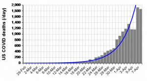
The blue line is a simple exponential curve fitted to the data for 40 days up to April 8th (data from the COVID Tracking Project.) The average growth rate was 23% per day — a doubling time of 3.3 days, or a factor of over 500 per month.
It is helpful to look at exponential growth on a logarithmic scale. This chart includes new reported cases (light gray) as well as deaths (dark gray). The blue line are exponentials fitted to the data. They appear as a straight lines because of the log scale:
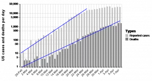
The line for reported cases fitted grew at 34% per day from 29 February to 26 March: This implies a doubling rate of 2.3 days — a factor of 8 per week or 7000 per month. You can see that the slope of the line for cases is steeper than for deaths – 34% vs 23% growth per day. The fact that reported cases grew faster than deaths is almost certainly not because the number of actual infections was growing that fast – but rather because an increasing proportion of infections were reported as the availability of tests grew even faster than the number of actual infections. Early on, tests were so scarce that they were used only those with severe symptoms, or contact with confirmed cases. Now more people with moderate symptoms are being tested – and so reported cases reflect a larger fraction of actual infections.
It is a bit surprising that a simple exponential fits US total cases and deaths so well, at least through the end of March. Epidemics in the US started in several places at different times – Seattle, Northern California, New York, and now many other places. The sum of multiple exponentials starting at different times is not necessarily an exponential. But, so far in the US it’s been a reasonable approximation.
We are now starting to see hopeful signs that the epidemic will peak soon. New reported cases starting flattening around March 25th. For deaths there was a flattening for a couple of days followed by a spike over the last two days to April 8th. Experience from Wuhan and Italy, suggests that there is a lag of 2 to 3 weeks before we can see the effects of widespread suppression on death rates. Stay-at-home orders for non-critical occupations started in March 17 for the San Francisco Bay area, March 20 for New York, and is now in place for most but not yet all other states.
What we can learn from the Suppression Triangle in China
We can look at China for a view of a possible future. The next chart shows the growth and suppression phases for reported cases and deaths in China on a log scale. The light gray and dark grey bars show the number of reported cases and deaths, respectively, in China from January 15 to March 25th, 2020.
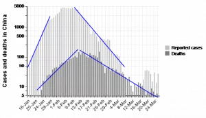
As before, the blue upward sloping lines are exponentials fitted to reported cases (16 to 28 January) and deaths (21 January to 12 February). In the initial phase of the epidemic, China reported a growth rate of 41% per day for cases and 15% for deaths. The downward sloping blue lines are exponential decay lines fitted to the decline in cases from 10 Feb to 8 March, and deaths from 13 February to 26 March. (We omitted later dates due to greater concerns about reliability of the data, and because they are not needed for our purposes here.)
For deaths, the sloping lines almost meet at the peak on Feb 12th, with the two lines forming a Suppression Triangle. It provides a simple way to visualize the growth and suppression of the pandemic in a country or region. The triangle for deaths lags the triangle for reported cases by about 10 days, reflecting the average time from a case to be reported to death. This is not the same as the lag from the initial infection which may be 5 to 12 days before diagnosis.
The “Triangle” is, of course, a simplification. There is no sharp break from growth to suppression phases. Rather you see a gradual slowing of growth and then flattening. These rounded peaks reflect two factors: First, there is considerable variability among cases in the time lags from infection to reported diagnosis, and then from diagnosis to death. Second, measures to control and suppress the pandemic were not imposed at a single point in time throughout China. The city of Wuhan imposed a lockdown on Jan 23rd and cordon sanitaire (travel ban) on Jan 23, followed by the entire province of Hubei, at a time when it had only 700 confirmed cases and 3 deaths. China added travel bans and lockdowns over many other cities and provinces over the following 2 weeks.
Nevertheless, it is interesting that the rate of increase in new cases (most from Wuhan at that point) started to taper off on Jan 28th less than a week after the initial lockdown on Jan 23rd. New cases started declining after 2 weeks, around 4th February. Deaths started falling 3 weeks later on Feb 13th. These time lags are consistent with the estimated averages of 4 to 7 days from infection to symptoms, and about 3 weeks from infection to death.
It’s important to notice that the downward slope of suppression is less steep than the upward slope in the growth phase. For new cases in China, the slopes were 41% per day on the way up in the initial stages of growth and -16% on the way down. For deaths, they were 15% and -8.5%, respectively. Why does this matter? The lock-down has, of course, an enormous effect on the economic activity. The longer it takes before the suppression phase reduces infections to a level that can be controlled by targeted isolation instead of widespread lockdown, the larger the damage to the economy.
China ended the official lockdown of most of Hubei province on March 24th, and is ending controls in Wuhan and other areas in early April. The total length of economic lockdown was about 2.5 weeks during the growth phase from initial controls in late January to when cases started falling after February 12th, plus about 6.5 weeks from the peak to early April when controls are being removed – for a total of about 9 weeks. Even now, the effects have not quite ended since some Chinese citizens and provincial authorities seem to distrust Beijing’s assurances that the outbreak is under control.
Implications for the USA and other countries
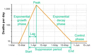
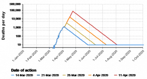
Here’s a view of the basic elements of a suppression triangle:
The first key point – well-known to epidemiologists and others that understand exponential growth – is that the number of people who get sick and die is highly sensitive to how soon a society imposes and accepts strong controls. With the death rate growing at 25% per day, every day of delay results in 25% more illness and death. Every week of delay increases them by a factor of 4.7. Every month by a factor of over 800. That’s why experts, including WHO and CDC, have pressed for urgent action. And why there have been huge differences in the impact of the epidemic between regions that responded rapidly, notably China, South Korea, Taiwan, and Singapore, and those that have not.
Who knew that the failure to grasp the implications of exponential growth could be so dire? Actually, quite a few people, and now an exponentially increasing number of people.
When can the US lift the Shutdown?
The “triangle” model assumes that the shutdown will be lifted when the rate of new cases or deaths falls below some “acceptable” threshold – in this example, 10 deaths per day in the USA. After that, public health authorities must keep an eagle eye out for new outbreaks with extensive surveillance and testing for possible new outbreaks, and isolation of any who test positive. That process is challenging, but seems to have proved effective so fare in South Korea, Taiwan, and Singapore. Tomas Pouyo calls this suppression strategy “the hammer and the dance”.[HD] The “hammer” means strong and strict control measures to bring infections down to a low level. The “dance” means careful monitoring and adjusting controls up and down to keep infections at that low level after we release the most stringent controls, allowing most people go back to work or school.
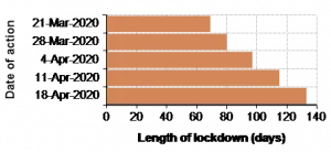
A second key point is that the sooner a government imposes controls the shorter the lock-down time and the less damage to the economy. This illustrative graph shows the approximate length of lockdown by date of action. The longer you delay the more people are infected, and so the longer it takes to suppress the epidemic. If the US had imposed controls on 21 March, the lock-down would be 69 days — until around June 1st. A delay until April 18th would cause a lock-down almost twice as long at 133 days – until August 31st.
The US epidemic is already much larger than that in China in absolute numbers and even more in numbers relative to the much smaller US population, as well as in its wide spread around the country – compared to China that confined the worst outbreak to Wuhan. So it is likely to take much longer for the US to suppress the epidemic, even if the US can maintain the same decay rate as China did — about 8.5% reduction in deaths per day assumed in the graphs above.
Are US suppression controls as strict and effective as China’s? And will Americans continue with them until the epidemic is suppressed down to a small enough level, even in the face of increasing calls from the White House and elsewhere to moderate them? This chart shows the effect of less effective controls and hence slower decay rates of 5% or 7%, or faster decay at 10%.
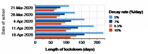
It is immediately apparent that any moderation in controls, such as too early relaxation and allowing more people back to work, could dramatically extend the length of the lockdown. Far from reducing the economic damage, premature relaxation of controls could dramatically increase the damage to health and the economy – with a much longer period of lock-down or alternating relaxation and extensions of lockdowns.