Skip to content
Analytica > Blogs > Early COVID-19 decay rates for countries that have peaked

Early COVID-19 decay rates for countries that have peaked

In previous articles [C20a, H20], my colleague and I have written about how the number of cases and deaths from COVID-19 follows a triangle shape over time when plotted with a log-scaled Y axis. A log-Y axis turns exponential growth into a straight line with a positive slope and exponential decay into a straight line with a negative slope. The negative slope results from the effects of social distancing measures. There is a roughly three week time lag between the introduction of lock down measures to the peak of the daily deaths curve, due to the fact that people who just caught the disease when social distancing starts and will eventually die from it, typically die about three weeks later.

Explains the elements of a suppression triangle
The Triangle Suppression model on a log-Y plot. After a time lag, the impact of lock down measures kicks in, causing an exponential decay. Figure taken from [H20].

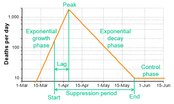
A key prediction of the Triangle Suppression model is that the decay phase is likely to be slower than the growth phase. In China, the decay during recovery was slower the growth phase by a factor of two. For the rest of the world where only less extreme lock downs are possible, the model predicts that the recovery will occur more slowly.  In [C20b], I critiqued the IMHE model [IMHE20] from HealthData.org, where my largest concern was the assumption that recovery will occur at the same rate as growth, which underestimates the length of the recovery time relative to the Triangle Suppression model.

A few countries appear to have crossed a peak, with just enough data to get a preliminary reading of their decay rates.  In this article, I share these graphs, and look at the ratio of growth rate to decay rate for these countries.

Daily deaths

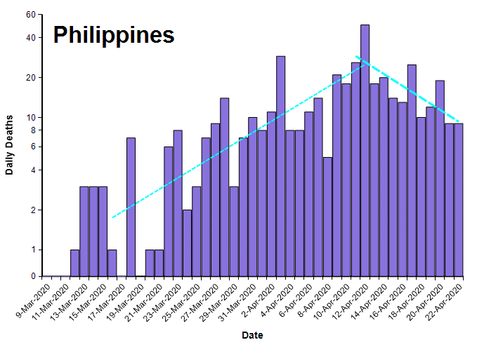
The plots in this section show the number of deaths per day from COVID-19 (from the John Hopkins data set [JH20]) for several countries that seem to have crossed a peak, plotted on a log-Y axis.  Exponential growth and decay lines are super-imposed.

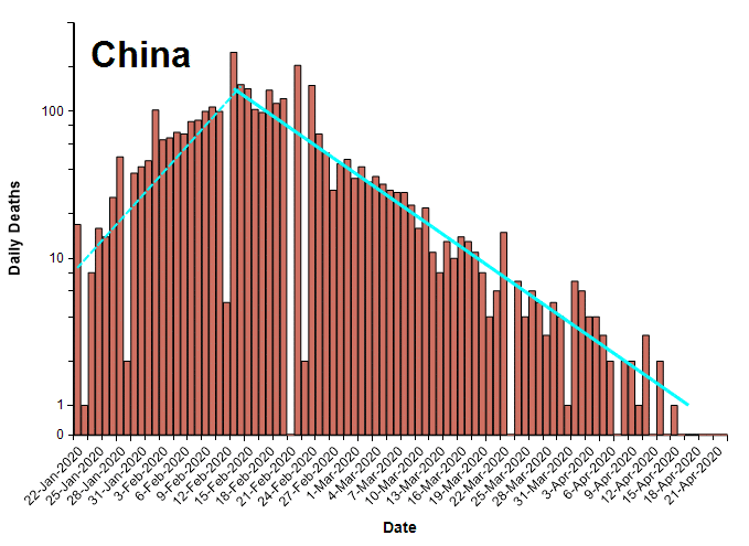
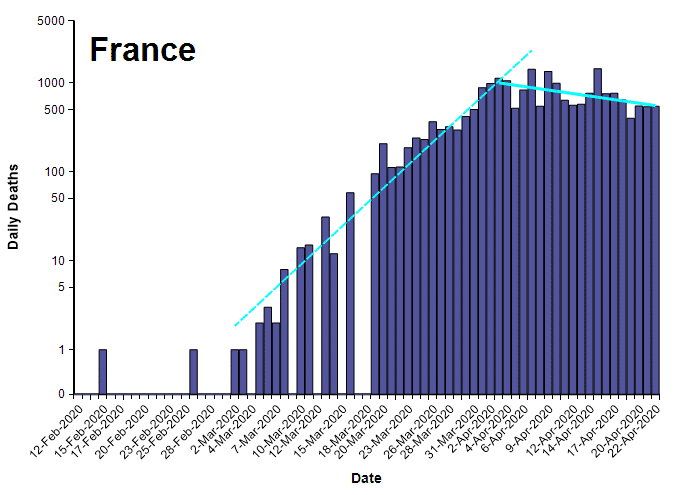
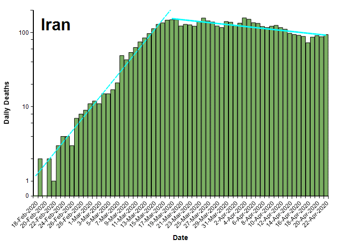
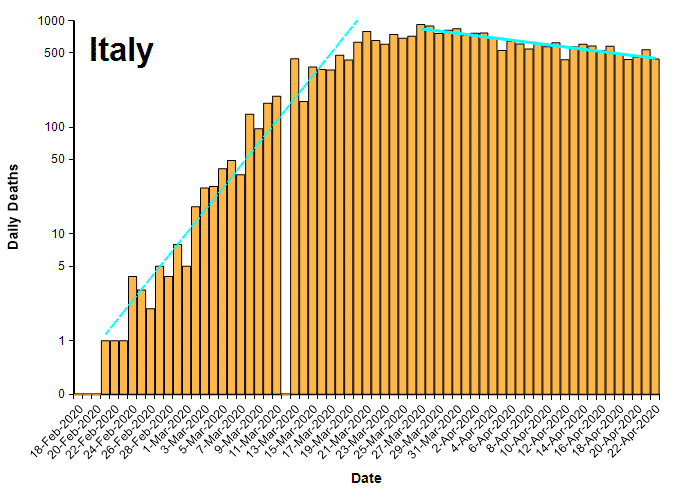
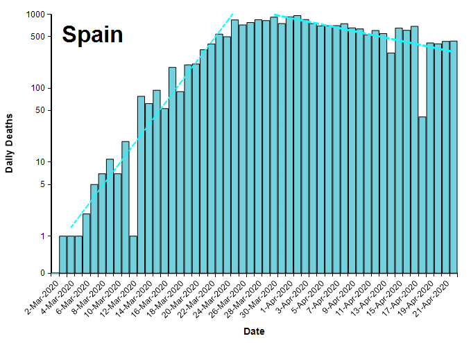
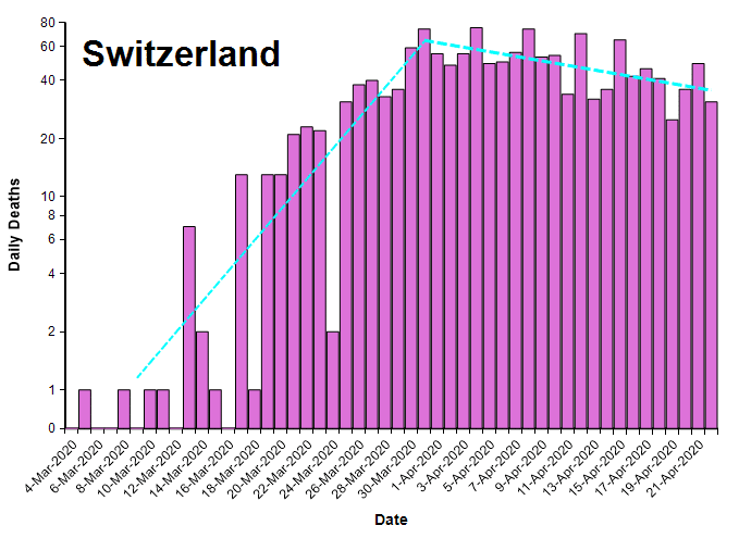
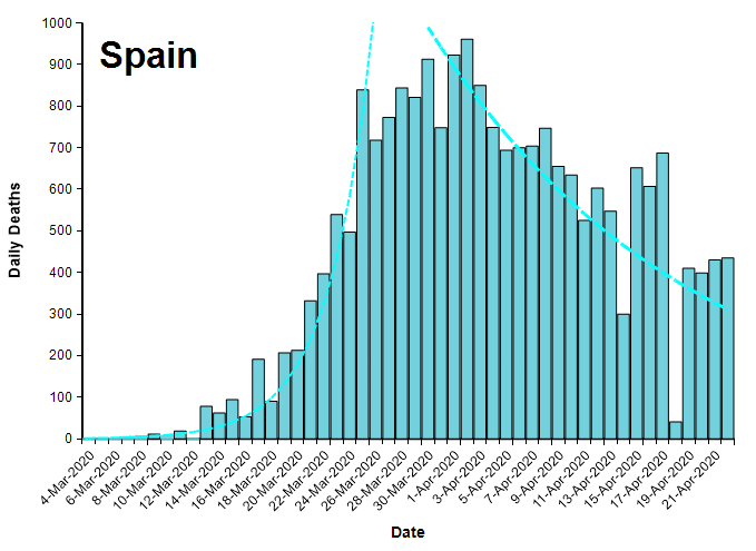
It is worth mentioning that the number of deaths per day is already below half of their peak rates for these countries (except Iran), which by any measure is a big improvement. On a linear Y scale, a reduction to 1/2 the peak rate looks dramatic, as seen in the same data for Spain shown here with a linearly-scaled Y axis.

Daily deaths from COVID-19 in Spain on a linearly-scaled Y axis. Same data as the earlier plot for Spain.

Comparison of growth and decay rates

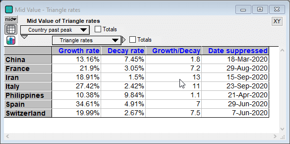
The following table compares the daily growth and decay rates for each country. The Growth/Decay column shows the ratio of the growth rate to the decay rate. Currently, the recovery rate varies from half the growth rate (in China) to 1/13th as fast (Iran). The final Date suppressed column shows the date when the decay trend line crosses the ten deaths per day level.

The daily growth and decay rates, and their ratio. The final column shown the date when the current decay trend line crosses 10 deaths per day.

Summary

The exponential decay rate during recovery gives us an indication of how long the recovery phase will last, assuming today’s level of lock down measures remain in place. The decay rate may improve with medical breakthroughs, tighter lock downs, high levels of immunity, or altered societal behaviors. They may get worse, or even reverse, with loosing of social distancing measures.

With the exception of China, all the countries shown here appear to have barely crossed the peak. The apparent decay rates as of today are preliminary given that these countries have not been past the peak for very long.

References

Share now 

See also

air conditioner outdoor unit

Building electrification: heat pump technology

Lumina set out to build a useful tool to assess the benefits of heat pumps. Learn more about heat pumps and their impact.
More...

Heat pumps 101

Heat and cool your home while saving energy and reducing emissions by adopting heat pump technology. Learn more about this transition and heat pumps by watching this webinar.
More...
Heatpump

Navigating the heat pump landscape

Fort Collins, Lumina, and Apex Analytics have created a tool to help reduce greenhouse gas emissions by optimizing building electrification programs.
More...

US gas leaks much larger than previously estimated

A new Stanford-led study on natural gas leak rates from oil and gas activity across a large fraction of the US are about 3x more than previous government estimates. The
More...

See also

Building electrification: heat pump technology

Lumina set out to build a useful tool to assess the benefits of heat pumps. Learn more about heat pumps and their impact.

More…

Decision making when there is little historic precedent

Learn how to make decisions and strategic plans in uncertain situations, where historical data is not available. See how to model this in Analytica with clarity and insight.

More…

Does GPT-4 pass the Turing test?

In 1950, Alan Turing proposed “The Imitation Game”, today known as the Turing test, as a hypothetical way of measuring whether a computer can think [1]. It stakes out the...

More…

What is Analytica software?

Analytica is a decision analysis tool that helps you generate clearer and more justified results through modeling.

More…

Download the free edition of Analytica

The free version of Analytica lets you create and edit models with up to 101 variables, which is pretty substantial since each variable can be a multidimensional array. It also lets you run larger modes in ‘browse mode.’ Learn more about the free edition.

While Analytica doesn’t run on macOS, it does work with Parallels or VMWare through Windows.


    Analytica Cubes Pattern

    Download the free edition of Analytica

    The free version of Analytica lets you create and edit models with up to 101 variables, which is pretty substantial since each variable can be a multidimensional array. It also lets you run larger modes in ‘browse mode.’ Learn more about the free edition.

    While Analytica doesn’t run on macOS, it does work with Parallels or VMWare through Windows.


      Analytica Cubes Pattern

      Download the free edition of Analytica

      The free version of Analytica lets you create and edit models with up to 101 variables, which is pretty substantial since each variable can be a multidimensional array. It also lets you run larger modes in ‘browse mode.’ Learn more about the free edition.

      While Analytica doesn’t run on macOS, it does work with Parallels or VMWare through Windows.


        Analytica Cubes Pattern

        Download the free edition of Analytica

        The free version of Analytica lets you create and edit models with up to 101 variables, which is pretty substantial since each variable can be a multidimensional array. It also lets you run larger modes in ‘browse mode.’ Learn more about the free edition.

        While Analytica doesn’t run on macOS, it does work with Parallels or VMWare through Windows.


          Analytica Cubes Pattern

          Download the free edition of Analytica

          The free version of Analytica lets you create and edit models with up to 101 variables, which is pretty substantial since each variable can be a multidimensional array. It also lets you run larger modes in ‘browse mode.’ Learn more about the free edition.

          While Analytica doesn’t run on macOS, it does work with Parallels or VMWare through Windows.


            Analytica Cubes Pattern

            Download the free edition of Analytica

            The free version of Analytica lets you create and edit models with up to 101 variables, which is pretty substantial since each variable can be a multidimensional array. It also lets you run larger modes in ‘browse mode.’ Learn more about the free edition.

            While Analytica doesn’t run on macOS, it does work with Parallels or VMWare through Windows.


              Analytica Cubes Pattern