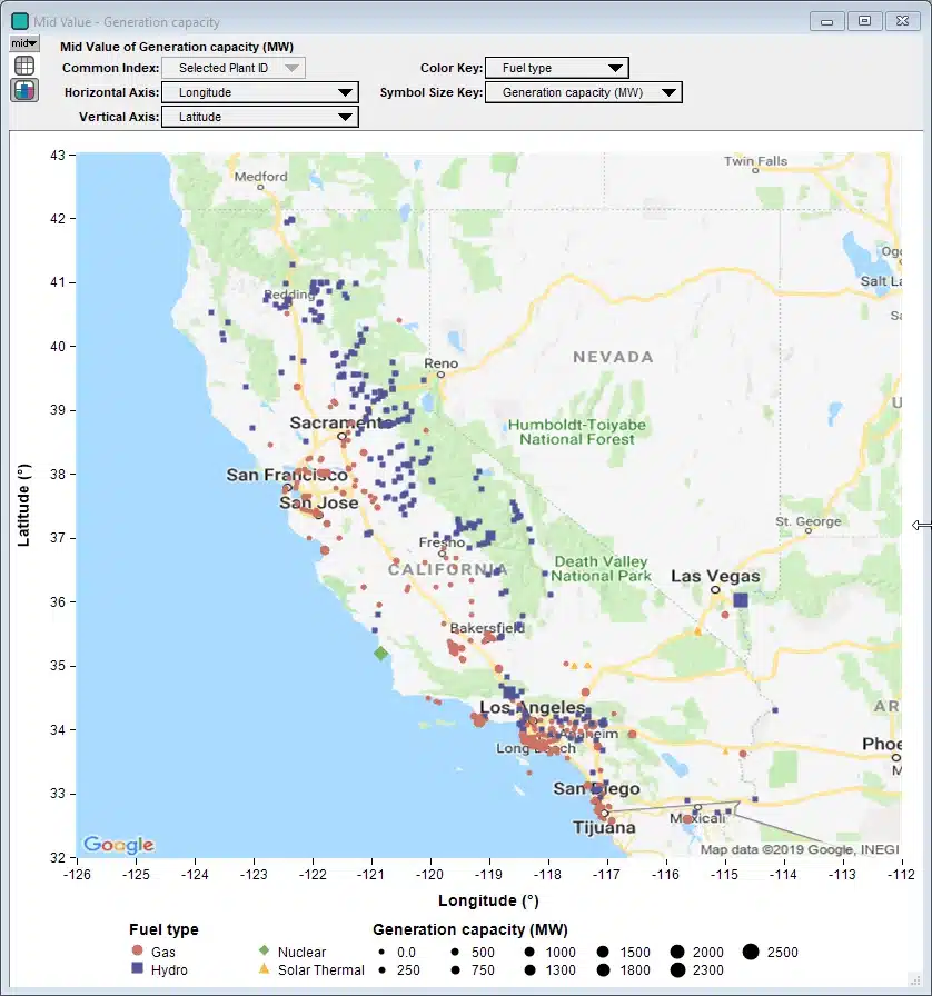
Here is what the result graph for the variable Generation Capacity looks like:


It uses symbol size to depict the generation capacity and symbol shape and color to depict fuel type for all California power plants identified by the California Natural Resources Agency. Using a pulldown in the model, you can select any subset of fuel types to show, with the full set of fuel type options being Battery, Coal, Biomass, Landfill gas, Digester gas, MSW, Gas, Hydro, Nuclear, Solar, Solar thermal, Geothermal and Wind.
The example model includes these highlights:
- It is quite fun to explore the data, learn where the different types of power plants are in California (and a few in neighboring regions).
- The data is downloaded from the California Natural Resources Agency’s website as a CSV file.
- If the download fails, if falls over to a cached snapshot on a Lumina web server. See how easy this is to accomplish.
- It parses the CSV file. (an example of Analytica’s ParseCSV function in action).
- User selects a subset of the fuel types using a MultiChoice pulldown.
- Downloads and displays a Google Map behind the data. It gets the map for to the data being plotted.
- The first time you try it, it guides you through the process of getting your own Google API key, and saves it so you never have to enter it a second time.
The model requires the Analytica Developer edition or better, and Analytica 5.2 for both the data download and the Google map download. With an Analytica subscription, you can get the beta build from the Beta Tester Page. If you are reading this after the 5.2 release (in or after April 2019), just use the current Analytica release.
Of course the flashiest part (and the title of this blog post) is the plotting of the data over the Google Map, and I’m sure this is something many of you will want to do in your own models. I’ve created an Analytica 5 Video Short showing how I did it in this example with Generation Capacity.
If you enjoyed this, please remember to follow / befriend Lumina’s social media channels!


