On Monday of this week, the Imperial College COVID-19 Response Team released an influential report that forecasts how social isolation measures for mitigation and suppression strategies will impact the COVID-19 progression in the US and Great Britain. They modeled several levels of social isolation with particular attention paid to the load on hospital capacity.
The Imperial College report does an excellent job of spelling out the assumptions that went into their model, and they made use of the best data available at this time. It is a stellar example of quantitative modeling. But, their paper reports results in a static form, instead of telling people like me how to download their model and interact with it (like altering assumptions, or enhancing it to include other factors).
But lucky for me, today Robert Brown shared a well-done model that examines the impact of social isolation on the progression of COVID-19 in the US. This is an important time to open source our models with the community of like-minded modelers, so we can learn from them and build off them. I can’t emphasize enough how informative it is to be able to interact with these models and explore different combinations of assumptions. I’d like to extend my thanks to Robert Brown.
Credits
Robert D. Brown, III, is a Senior Strategic Analyst in the Global Automotive Group at Novelis. He is based in North Atlanta, Georgia and was formerly the president and founding partner of Incite! Decision Technologies, LLC. He is a long time Analytica “super-modeler”, and has conducted Analytica training courses for over 15 years. He is highly respected for his leadership and expertise in decision and risk analysis.
Rob created the model featured in the posting.
How to obtain and run the model
The model is open source. To run it:
- Install Analytica free edition if you don’t already have Analytica installed. (Windows required)
- Download the model.
- Launch Analytica, click “Open Model” and select the model file.
From the Analytica Free 101 edition, you can calculate and browse all the results of the model, change the inputs and recalculate results, and browse all of the internals of the model. This is more than sufficient for exploring and understanding the model’s forecasts. If you are interested in expanding or altering the model, beyond just changes to the inputs, you will need a license for Analytica Professional (or better).
Using the model
As soon as you open the model, you’ll see a series of user inputs on the left side and key model outputs on the right side.
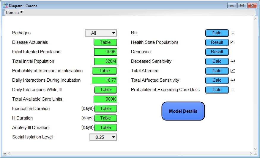
You can click a [Calc] or [Result] button to compute and view the results. Most of the results are probabilistic projections. When viewing a result, you can pivot to look at the result in numerous different ways or change the uncertainty view. Use the inputs on the left to change assumptions and input parameters. Explore the model logic by entering the Model Details module. Many of you will find this intuitive. If not, the first couple chapters of the Analytica Tutorial explain how to navigate a model like this.
Some results
Two weeks ago on this blog, I published the article Estimating US Deaths from COVID-19 Coronavirus in 2020. When Rob sent me this model, I was immediately interested to see how the projections compare. Before generating that plot, I retrieved the most recent numbers for the US from Worldometers.info and entered them into the model as follows.
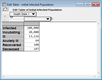
I had to estimate the first two cells since neither is directly observable, but I used numbers directly from Worldometers (as of 19-Mar-2020 3:00pm) for the final four cells. My rationale for the first two estimates are as follows: A ratio of 5:1 makes sense for infected to incubating since it appears to take about 5 days from infection to the onset of contagiousness, and about a day between the onset of contagiousness and first symptoms. And 20,000 for incubating seems consistent with the fact that 4,216 new cases were reported today, all of which were incubating cases yesterday.
Next, I evaluated a result. The model produced the following probability exceedance plot for the number of deaths in the next 365 days.
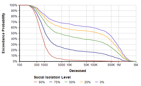
Each line shows the forecast for a given level of social isolation. A social isolation of 90% corresponds to the implementation of measures that reduce average daily interpersonal contact by 90%. The top purple line corresponds to no reduction in interpersonal contact. If you follow the 50% exceedance probablity to the yellow line, it predicts that a 25% average reduction in interpersonal contact results in a median of 156,400 deaths. The yellow line crosses 1M at 20%, meaning there is a 20% probability of more than 1 million deaths.
Side note: The Excedance probability view is new to Analytica 5.4 (which is in beta). But it is simply the CDF view flipped upside down, which you can view in Analytica 5.3 just fine.
One interesting thing I noticed was that before I entered the current numbers for the initial infected population, the model Rob first shared with me had all but the first cell (infected) set to 0. That made a big difference in the worst case outcomes for all non-zero levels of social isolation. That’s something you can try out yourself. It gives you a sense of how delays in the implementation of these measures matter.
So how does this model’s forecast compare to the forecast I made almost two weeks ago (on 10-Mar) for the number of deaths in the US in 2020? The plot above ran for 365 days, but my forecast was for the number of deaths 288 days from today. So to compare apples-to-apples, I added some variables in my own copy of the model to extract the forecast at day 288 and superimpose my previous forecast.
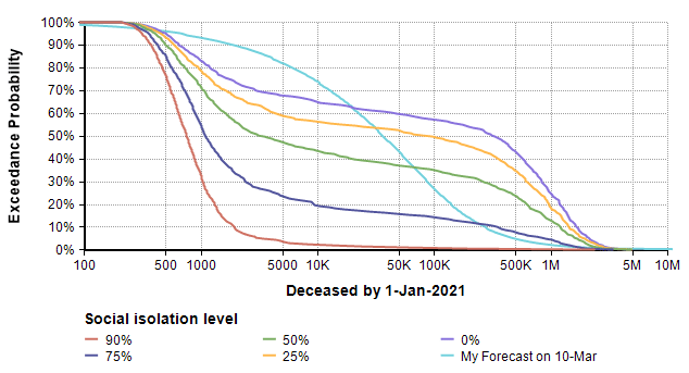
The difference in shape is interesting. The bi-modal shape of the model’s forecast comes, I believe, from the threshold that results when the reproduction number (the average number of people an infected person infects) passes through a value of 1. When the reproduction number is greater than 1, you see exponential growth, but when it is less than one you get exponential decay. Since infectiousness is uncertain, a bi-modal distribution results. A second observation is that 25% and 0% isolation cases are substantially more dire than my original forecast, and even the 75% isolation case has a more ominous right tail (the low probability but catastrophic outcome).
Rob’s model is a Markov model, which is a type of dynamic model. It has a lot of similarities to the SICR-model in my previous blog post, although I prefer the way Rob organized the health states into an index. Since it is a dynamic model, you can examine how the numbers unfold over time.
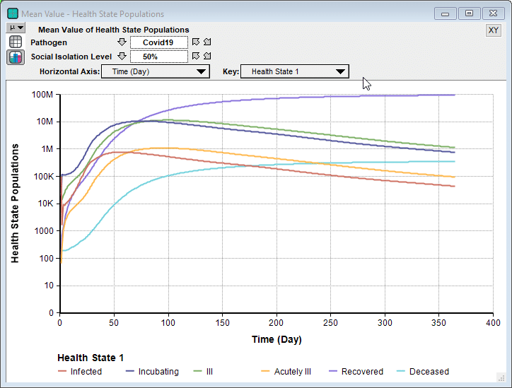
Interestingly, in some cases we see a second bounce, as seen here when 90% isolation is imposed.
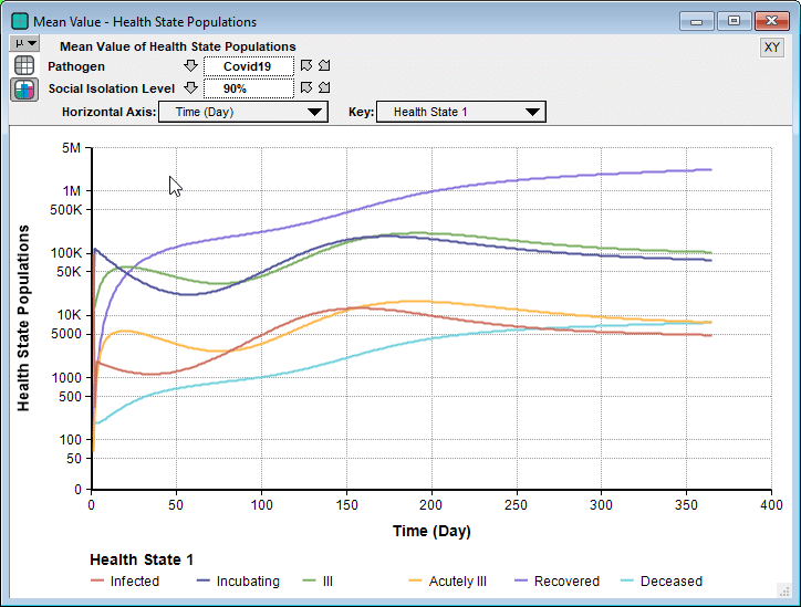
Unlike the Imperial College’s simulation for their recommended suppression strategy, where they relaxed social isolation when numbers got low, and then re-instated when they started to climb again, this model holds the 90% isolation constant for the entire simulation period. So the interesting bounce is not caused from a recurrence when the restrictions are relaxed. Instead, because the stock of incubating cases is still able to slowly climb, it eventually hits a point where it feeds the symptomatic states faster than the rates that people recover.
Sensitivity Analyses
An especially interesting feature of Rob’s model is the sensitivity analysis, something I haven’t seen included in other recent non-Analytica models of COVID-19 progression. The disease sensitivity result shows how sensitive the projected number of deaths is to each of the uncertain inputs, shown here for the 25% social isolation case.
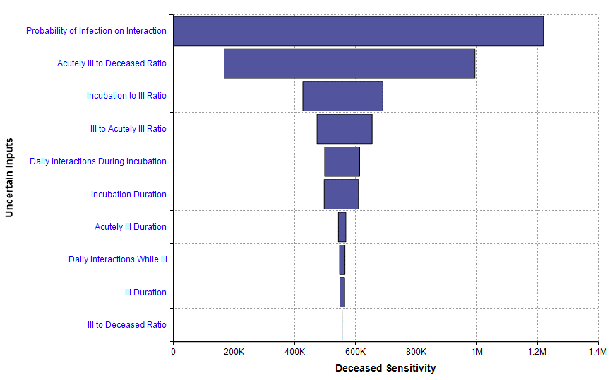
This sensitivity plot shows that two uncertainties have a substantial impact on the number of deaths within 365 days when a 25% isolation measure is adopted. The first of those inputs is the probability of infection on interaction. That tells us that the forecast could be improved if we can obtain better information about that parameter, and it also tells us that an intervention that reduces that parameter (wearing masks? 6-foot separations? Hand washing?) could have a big effect.
Limitations
Every model is an approximation of reality, with simplifying assumptions that are both useful and limiting. Rob’s model is no exception. It does not segregate the population by age or geographical location. As a result, mortality rates are taken to be a weighted average across all of the dimensions (like age) that aren’t modeled. It assumes transition rates are constant, which could change with medical breakthroughs or evolution of the virus. It treats the US as a closed system. It does not make fine-grained distinctions between levels of severity beyond just “ill” and “acutely ill”. It assumes recovered people do not become re-infected.
Conclusion
I want to thank Robert Brown for sharing his model with me, and allowing me to share it with all of you. I don’t want to place absolute trust in any one model of the rapidly evolving COVID-19 epidemic, but instead I find that there is something to be learned from looking at many different models. This is even more true when you can interact with a model and explore what happens across a range of different inputs. I found Rob’s model to be nicely organized — I had no problem quickly understanding exactly how it works — and I very much like several aspects. I especially like that he included a social isolation level decision, used an index for health state (giving it the structure of a Markov model), and included sensitivity analyses.